Graphical User Interfaces
Layered concepts

After spending the majority of my career in Hardware, I had little to no experience with digital products. I had been meaning to learn it more thoroughly, but never got around to learning the space as much as I wanted to. Even though so much of our world is digital at this point, there is a lot of thought that goes into the seemingly simple look of most apps and websites (Minimalism, while beautiful, is SO overused and has caused most platforms to look the same).
I wasn’t sure how I’d feel about this class, but software gives you so many more options to explore concepts and spaces that I want to dive into.
Goal #1: Get comfortable with Figma
During the last class, the instructors mentioned that our projects goal shouldn’t necessarily be about making something to show off on a portfolio, submit to a competition or become a business. The goal of a class project is, fundamentally, to teach you as much as possible.
So when we were asked to come up with ideas for a weather app, I chose pretty quickly to incorporate a mood tracking app into the weather app. I check the weather pretty regularly, but I’ve never really been able to keep up with a habit/mood tracker because I never build the ritual of checking it, so instead of creating a new habit, I could just tack it onto the one I already have. I was hoping to learn some illustration, but this idea had a lot more logic to it, so I went with it.
First I looked into a bunch of other mood tracking apps, seeing what they did and what I would want to adopt. Many of them were character based, trying to convince you to stay by building an emotional attachment (think of the guilt tripping Duolingo Owl), these had a lot of illustrative components and scene setting that were indicative of my first drafts, where the emoticons sat in a forest with the current weather conditions playing out behind them.
(insert sketch photos here)
I wanted to lay out the interactions and start testing them out, even before I really jumped into Figma, so I started using Origami, the software we were learning for high end prototyping animations. Unfortunately, Meta has only made the software available for Mac, so I also had to learn how to use Apple products. Luckily, I was able to use one of the schools computers and had a giant screen to build in, and I used my iPad to test the prototypes out.
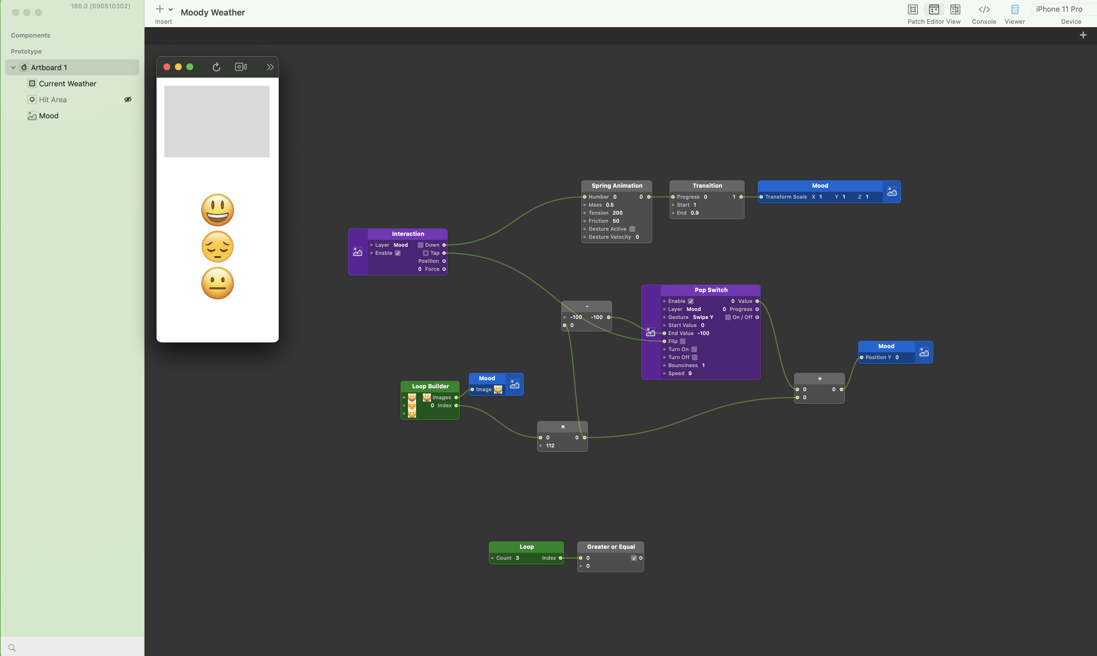
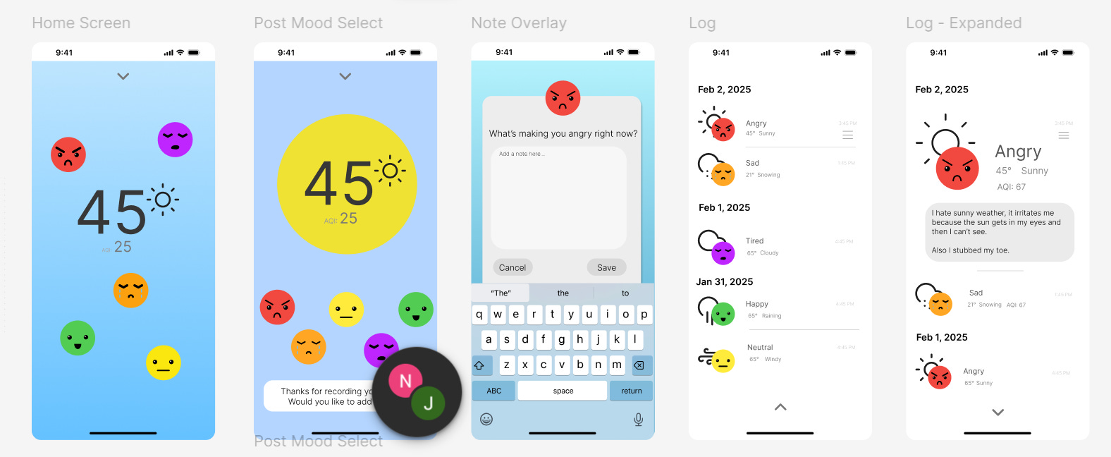
The emoticons are the real focus of the interactions, so they would set the tone of the entire project. I started mapping out what the entire thing would look like and then jumped into Figma. First, I wireframed the information to explore what layouts could potentially work.
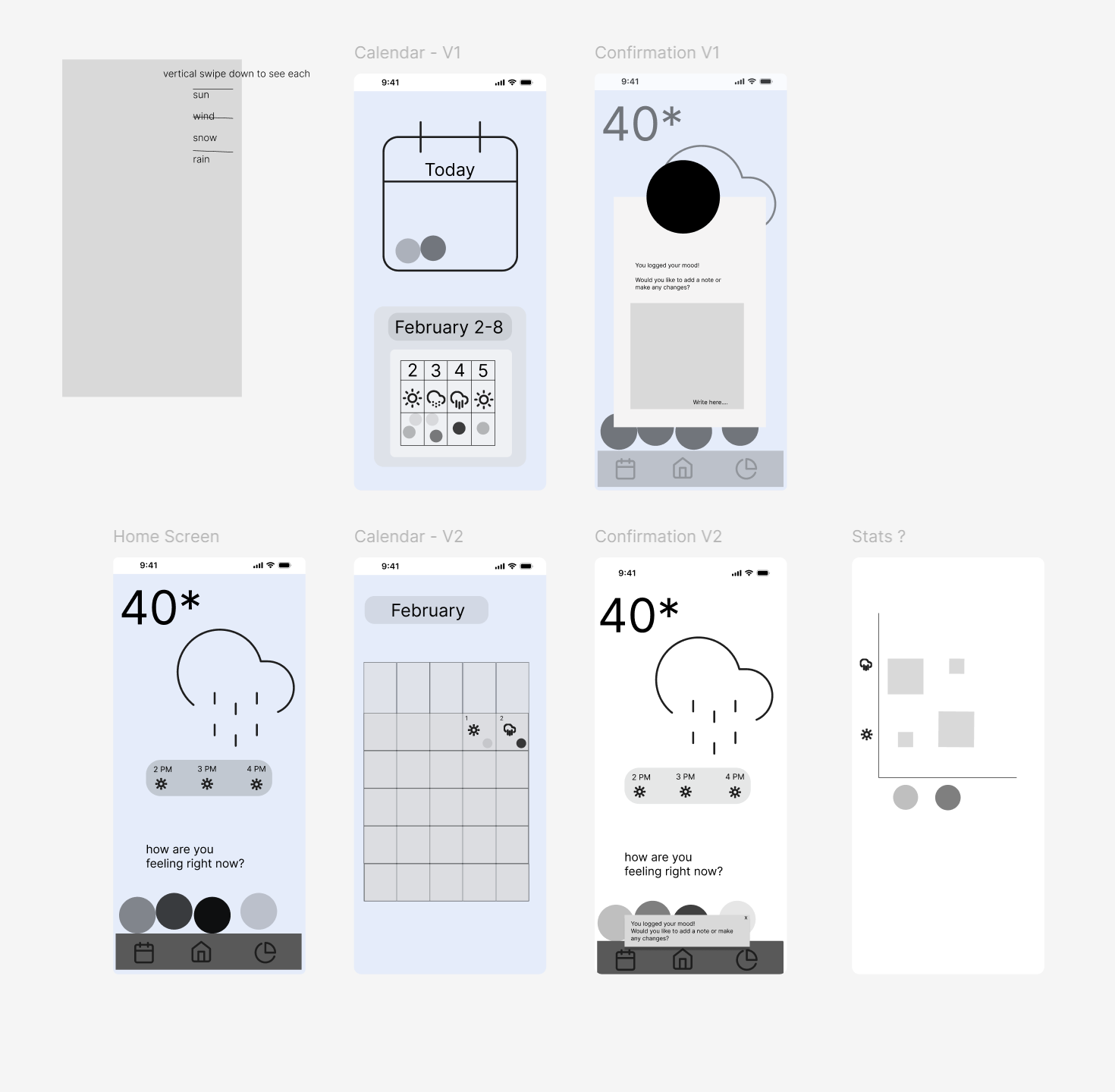
I got feedback to simplify the main screen and explore non-calendar ways of seeing the history, like just a list view, so I made a new version closer to the first sketch.
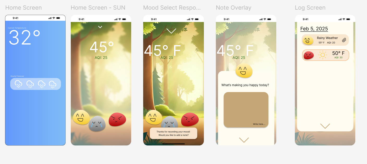
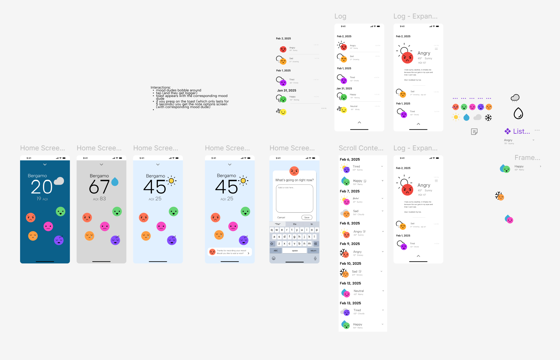
The first one bored me, and though the (AI generated unfortunately) background added personality to the app, it led to color scheming that just didn’t appeal to me. Beige/Browns can be nice, but I wanted something more professional. While I loved the more blobby shapes of the emoticons (affectionately called the Mood Dudes), round emoji faces do the same thing quite well.
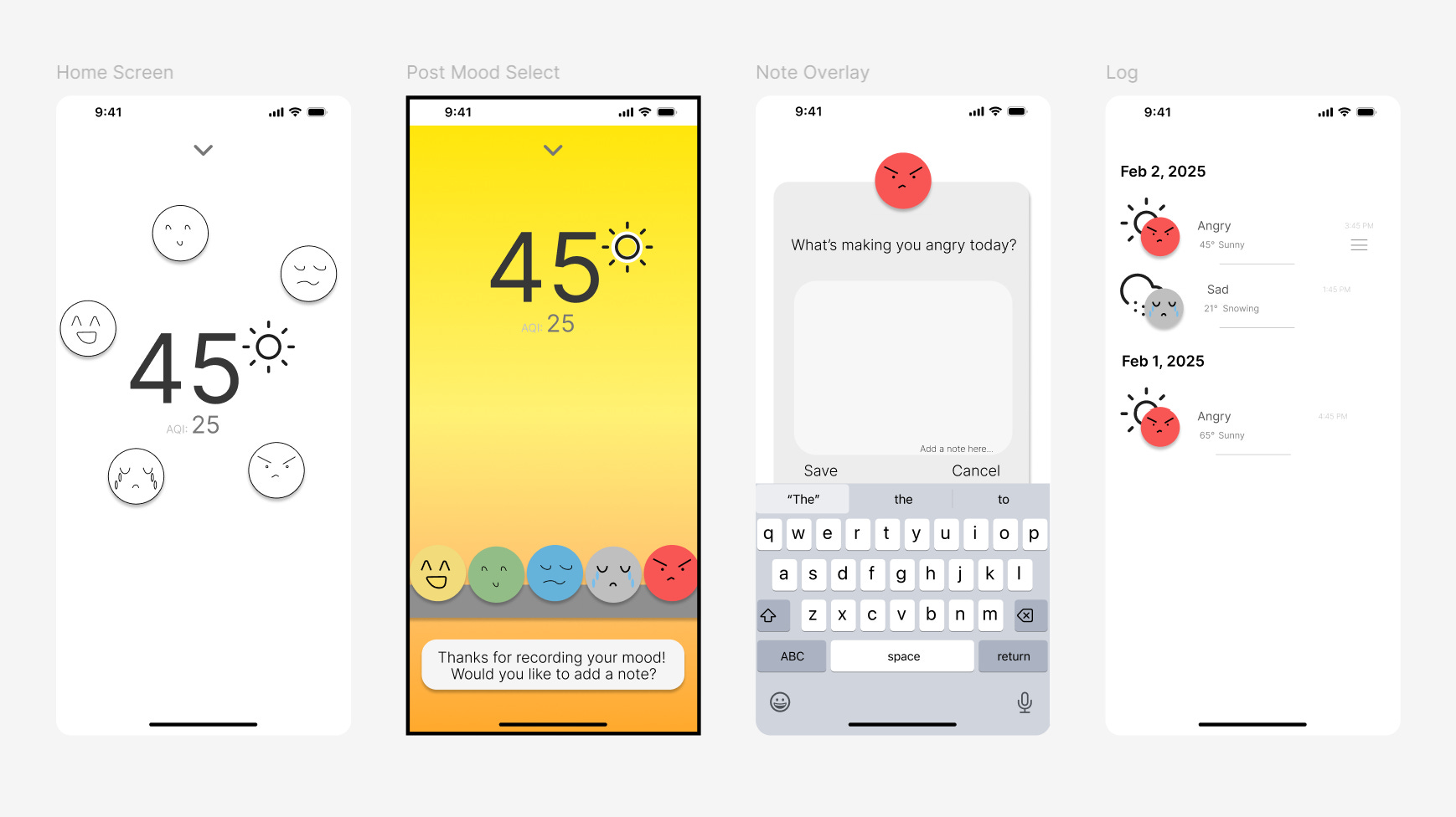
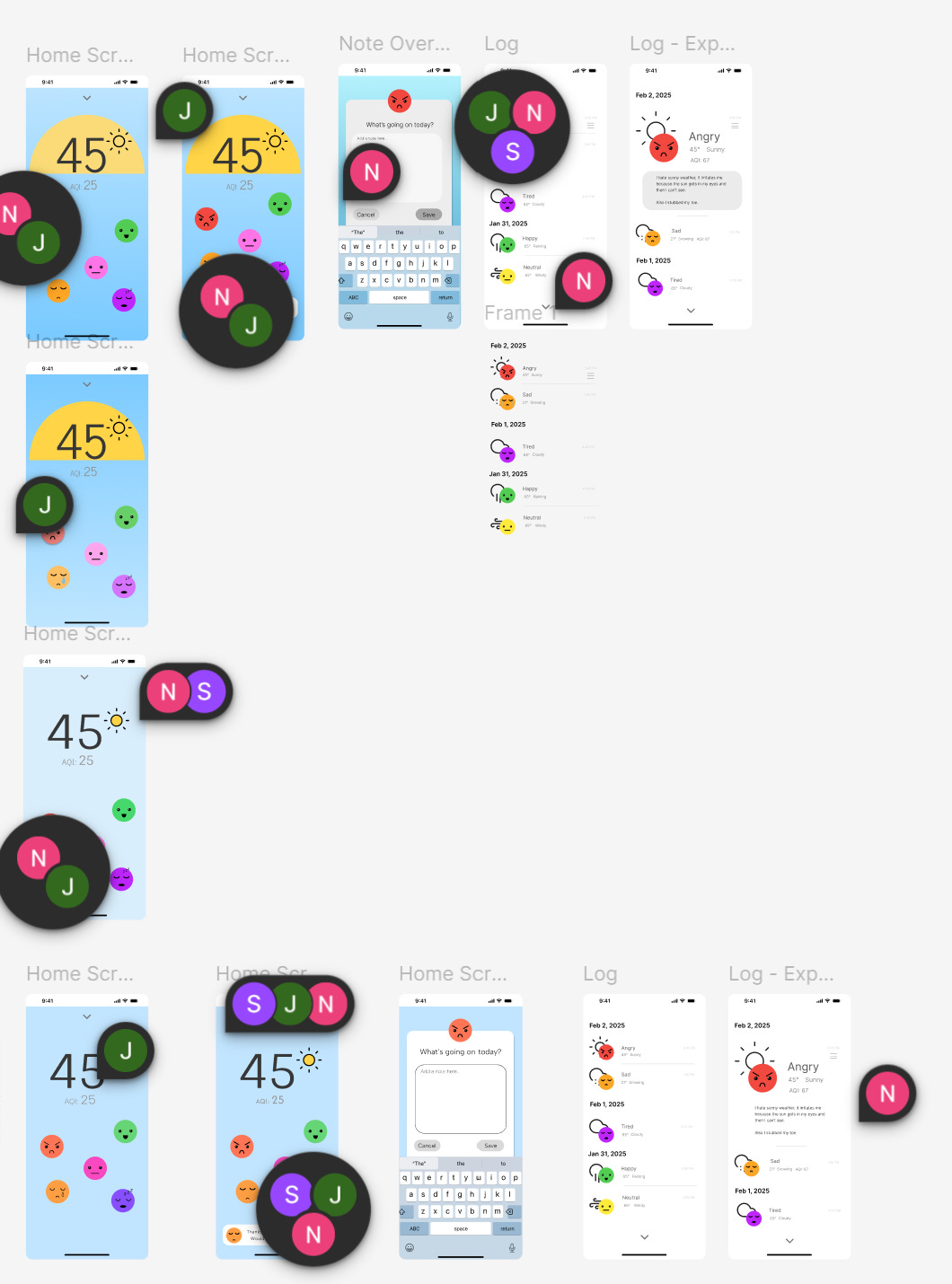
I played with having them float around, which people liked but would make them harder to tap, and I liked the way the list view worked, but the faces still felt underdeveloped, so I went online and looked at countless emojis before finding a few that I liked and redesigning them in Figma so I could utilize them.
Also, as much as I love gradients, I was running into a big issue in that colors are associated both with weather and mood. If I use gray for a rainy day, and also have gray for sadness, the two are automatically correlated, even if people like me are often unreasonably happy when it rains. That would defeat the entire purpose of the app to help you find a potential connection between weather and mood and instead might lead you towards certain solutions.
As I tried new emoticons, I still felt the colors and typography weren’t really working. The mood dudes really set the tone of the entire app, so they had to be exactly right. As much as I loved the gradients, the solid background was less distracting from them.
(The many comments don’t include the feedback I got from my classmates and instructors! Even a solo project is so collaborative, and iterative)
At this point, I was porting my Figma designs into Origami and a lot of the changes I was making were basically just getting things to work in the prototyping software. This included making components and utilizing autolayout for the repeated list elements, as well as strategically grouping the layers.
Goal #2: Build a project that teaches me as much as possible
Most of my time was spent working on Origami, the software we were utilizing for high end prototyping because it can do a lot of cool effects and animations. Origami is made by Meta solely for Macs and iOS, so I used the giant fancy desktop Mac we have on campus. Though it was occasionally frustrating to not be mobile, I liked working on the giant screen because Origami can get REALLY complicated.
I still think the overall design could be nicer, and I would have loved to add a stats page, but I feel like I learned a LOT in this process. I’m much more comfortable with Figma than I was before, and I started to get the hang of Origami logic by the end of the course.
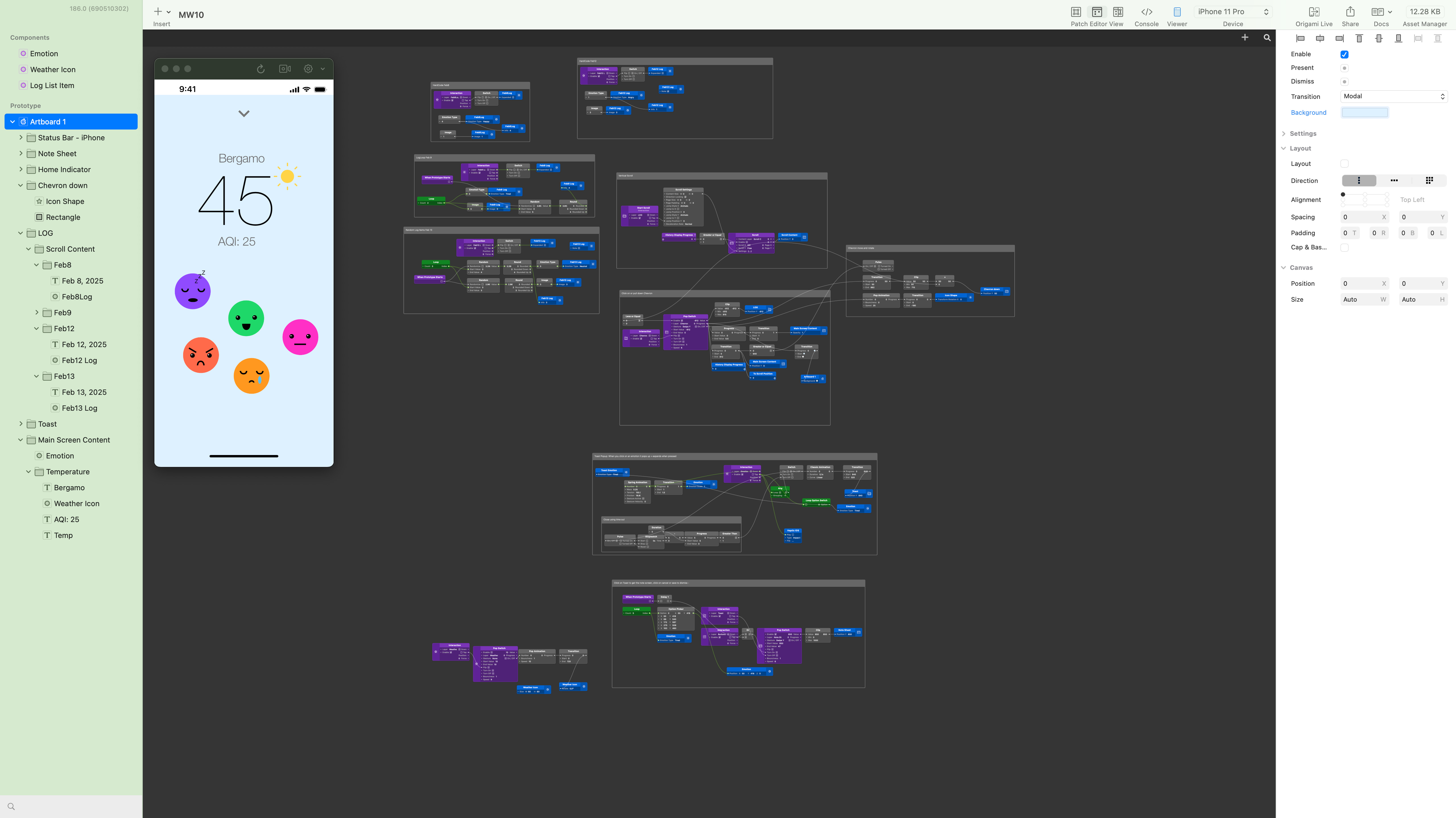
One of the major things I learned was about Components. All of the major elements - the weather icons, emoticon faces, and list items were ALL components, which is why I could control them individually and switch them out as needed, which was great when I wanted to change one of them and could have it automatically replaced along the entire program. Even though it’s always hard to look at your work and think it should be better, I am glad that I met my goals of building something that truly taught me a lot. I’m surprised by how much I liked building these digital experiences and how even really simple seeming interactions necessitate intentionality.
Though hardware will always have my heart, there’s little hardware without software, and taking this class makes me realize that I wouldn’t mind working in software/digital product design for a little while.
Notes
I read a great article about gamification this week, which really spoke to one of the many reasons I personally have stopped using tracking apps. Instead, I still keep a physical planner as a diary/tracker.
I was craving my homemade Baklava, so I made a batch this week! Here are some of the baklava recipes I’ve used: Babish & Weissman. I personally prefer Babish’s, though I think Weissman’s is more accurate.
A special shoutout to Sie-ce Karras & Natalie Chow two of my favorite visual designers who gave me a lot of great feedback <3
My class is full of incredible digital designers, and I was really inspired by their work. Special shoutouts to Eva’s color choices, Gayatri’s patterning, Harshita’s use of blur effects, Alec’s process of having a very clear idea and building upon it, Chey letting his exploration of software lead him to the interactions, and Shreya’s thoughtfulness in telling stories with history, color, and community focus.